

Trend Report
Introduction
Your Accessibility Score sums up where your site stands right now. The Trend Report builds on that, tracking your score over time so you can see how your team’s fixes are turning into real, lasting progress.
Open it from Trend Report in the site options.
You can also reach it from the View Trend Report link on your Site Dashboard, on the “Issues over time” card in the Site Statistics section.
Your Time Range
Trend Report shows your last 30 days. Longer views, first 90 days and then a full 12 months, open up over time so you can zoom out and watch your progress unfold over whatever timeframe matters most to you.
The report header shows the exact date window it’s covering, along with the conformance standard your site is measured against. Once more than one range is unlocked, a range switcher appears in the header so you can move between them. The 30- and 90-day views group your data by week; the 12-month view groups it by month.
Downloading Your Report
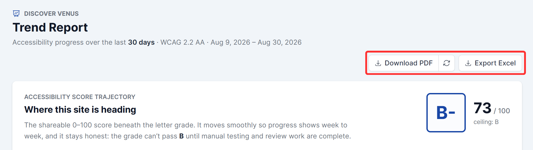
Click Export PDF or Export Excel at the top of the report. While the file generates, the button reads “Preparing PDF” or “Preparing Excel.” When it’s ready, the button splits in two: click Download PDF (or Download Excel) to save the file, or the refresh icon beside it to build a fresh copy. This is the same export process used on your Site Dashboard, so downloads happen in the background, and you can keep working while they generate.
The Score Trajectory Chart
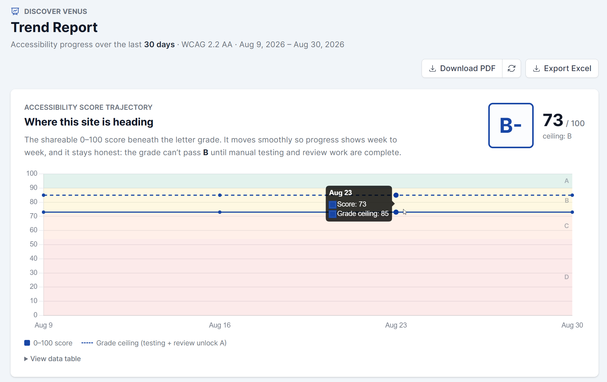
At the top of the report, your current letter grade and 0-100 score sit side by side, with your point change over the selected range and a “ceiling: [letter]” note underneath. Below that, the chart plots your score over the selected range, with colored bands behind the line marking your grade zone.
A dashed line on the chart marks your grade ceiling: the highest grade your score can reach until manual testing and review work are complete. The report explains this directly: “It moves smoothly so progress shows week to week, and it stays honest: the grade can’t pass [ceiling] until manual testing and review work are complete.”
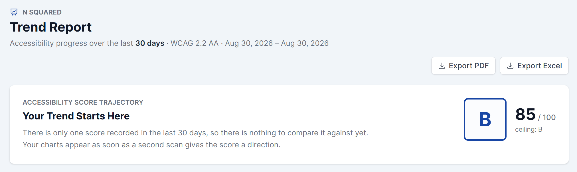
If your site has only one scored scan in the current range, the chart has nothing to compare it against yet. Your score and key metrics still show, and the report tells you the trend will start building once a second scan gives your score a direction to move in. An established site can land in this state briefly right after a scan-engine update, until a second scan runs under the new rules.
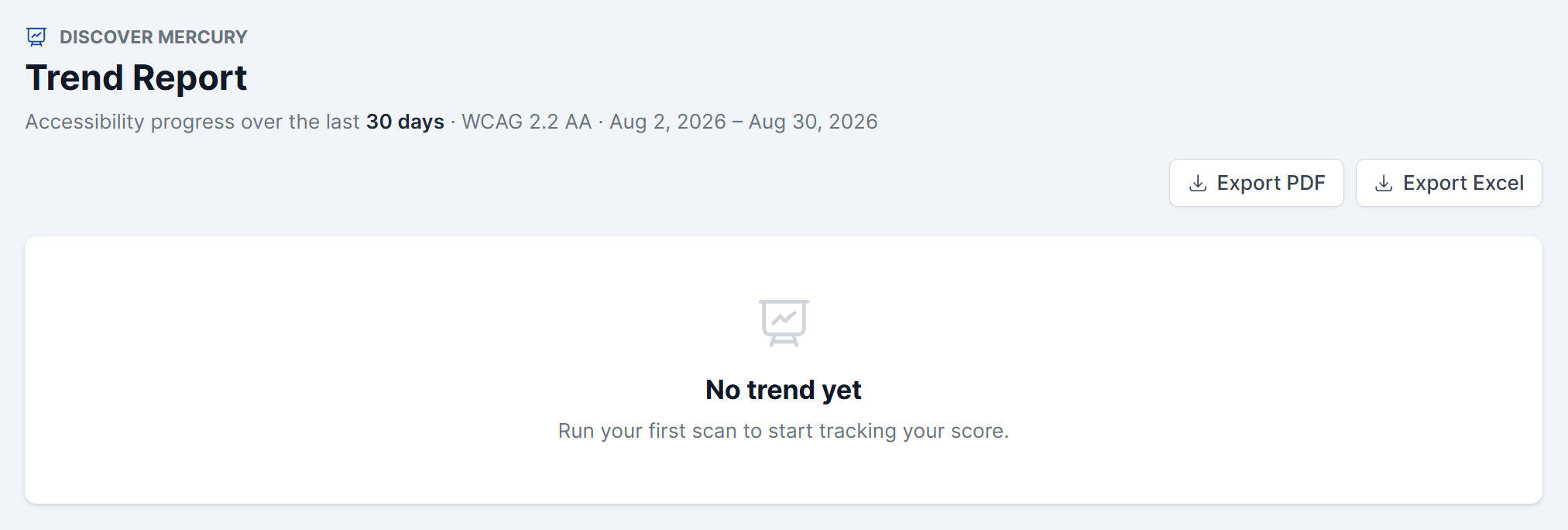
If your site has no scored scans in the range at all, the whole report is replaced by a short No trend yet panel: a brand-new site is prompted to run its first scan, and an already-scanned site is told the trend will build here as new scans run.
Key Metrics at a Glance
Just below the trajectory chart, four numbers sum up your progress for the selected range:
- Accessibility Score – your current score out of 100, plus how many points it’s moved since the start of the range.
- Open Issues – your current open issue count, plus whether that count has grown or shrunk over the range.
- Issues Resolved – how many issues your team fixed during the range.
- Manual Testing – your manual testing coverage percentage, with a note reading “holding grade at [letter].” Your score can’t pass a set ceiling until manual testing and review are complete, so this tile shows exactly what grade you’re capped at in the meantime.

Tracking Progress Chart by Chart
Below the score trajectory, the Trend Report breaks your progress down into a set of charts, each showing a different part of what’s moving your score. Every chart has a title and a short subtitle in the app; here’s what each one is telling you.
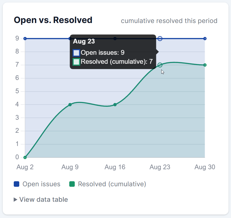
Open vs. Resolved
Your open issue count and your resolved count on the same timeline, with resolved shown as a running total for the range. When the resolved line climbs faster than the open line holds or falls, your team is clearing issues faster than new ones come in.
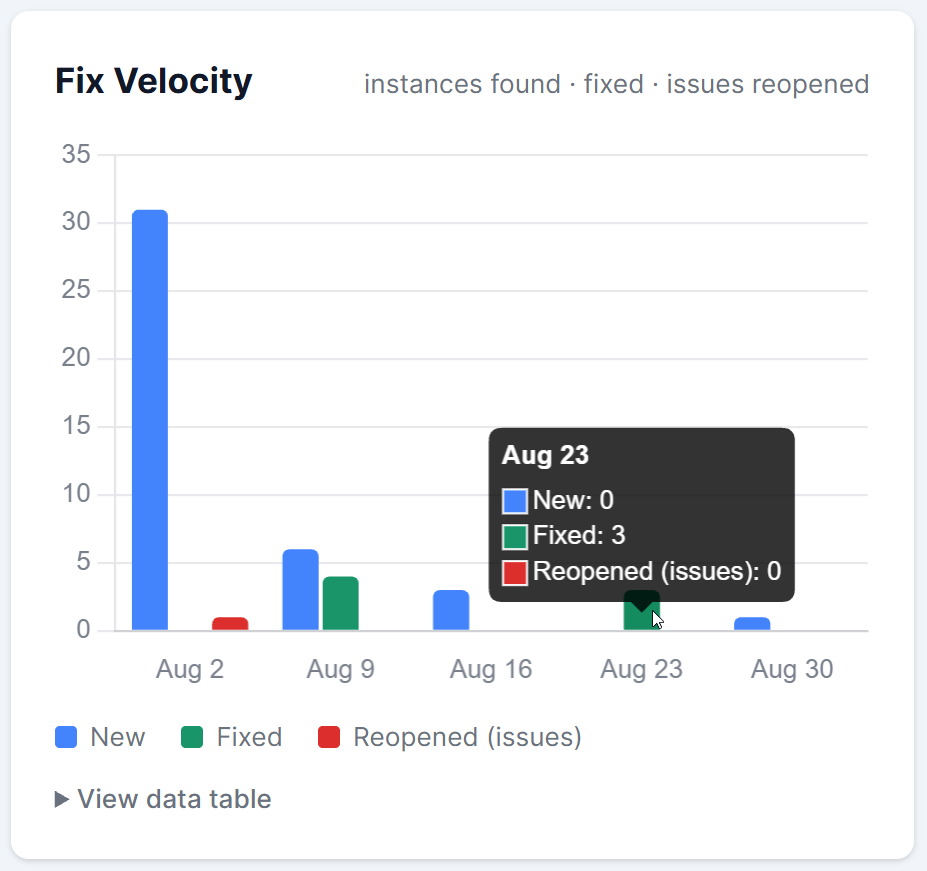
Fix Velocity
New issues found, issues fixed, and issues reopened, shown as bars for each week or month in the range. It tells you whether your team is keeping pace with incoming issues, and whether fixes are holding: a run of reopened issues means work is regressing after it’s marked done.
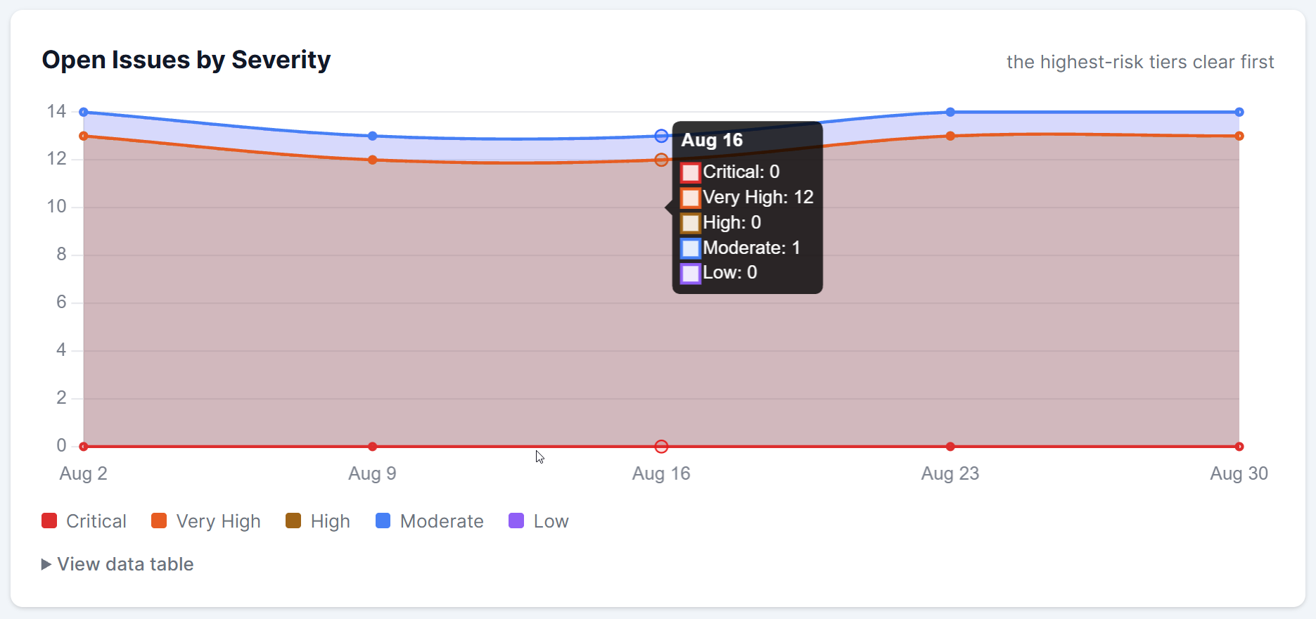
Open Issues by Severity
Your open issues stacked into five severity tiers, from Critical down to Low. Watching the Critical and Very High bands shrink first confirms your team is working the highest-risk issues ahead of the smaller ones.
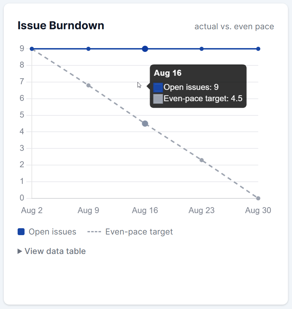
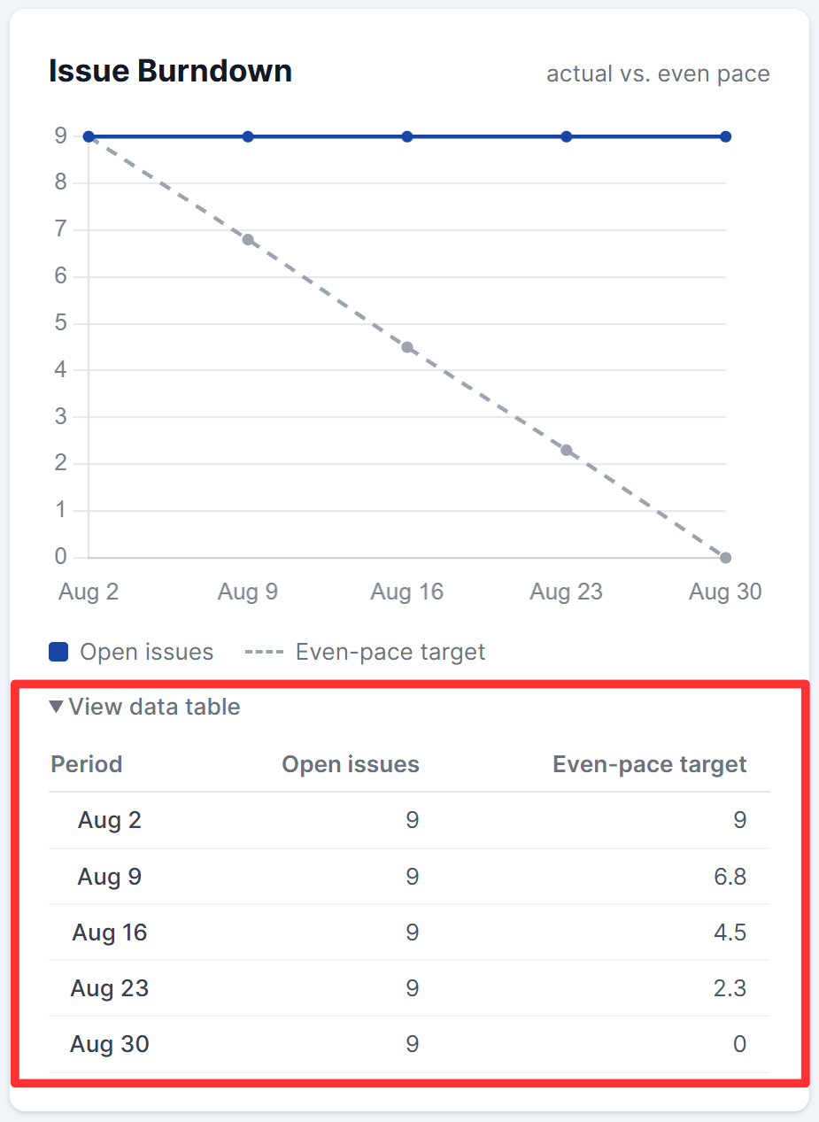
Issue Burndown
Your actual open issue count against an even-pace target: a straight line from where you started down to zero across the range. When your line sits below the target you’re ahead of schedule; above it, you’re behind.
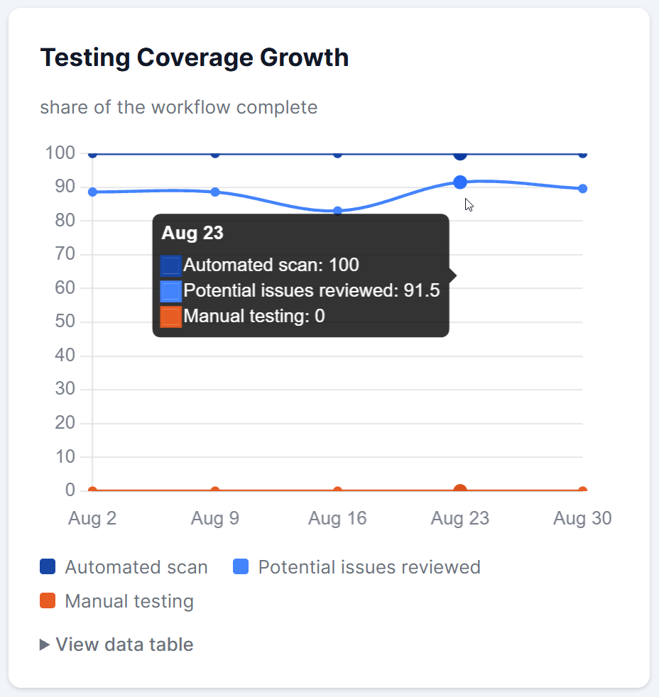
Testing Coverage Growth
Your progress through the testing workflow, with automated scanning, potential issue review, and manual testing each tracked as a percentage complete. Since your score can’t reach its top grades until manual testing and review are done, this chart shows how much of that work is still ahead of you.
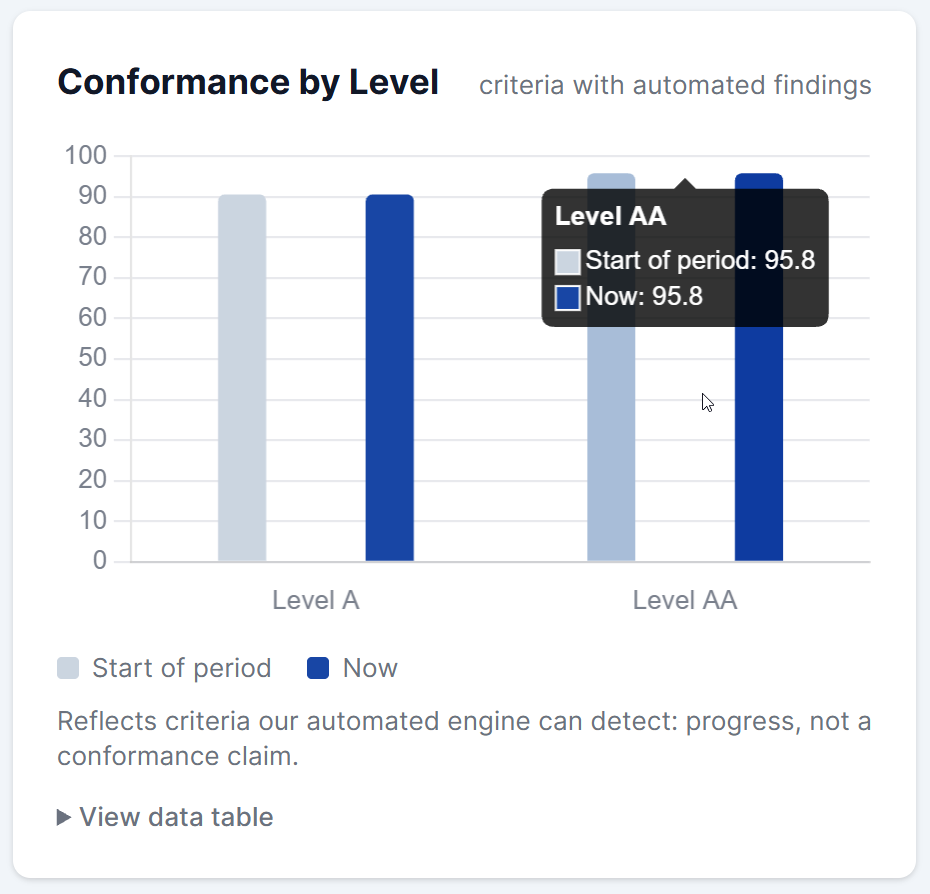
Conformance by Level
The share of testable success criteria that are passing at each WCAG level (A, AA, AAA), comparing the start of the period to now. This only counts criteria AAArdvark’s automated engine can check, so it’s a progress measure, not a conformance claim.
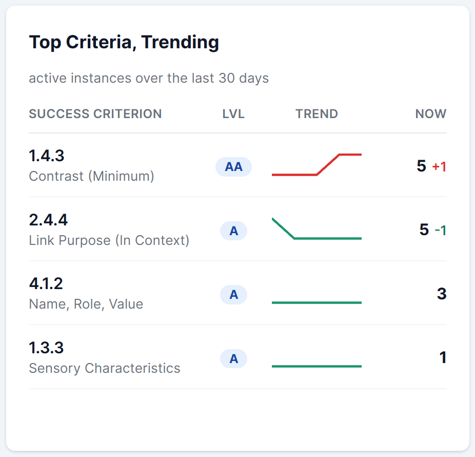
Top Criteria, Trending
The success criteria with the most open issue instances right now, up to six of them. Each row shows the criterion’s WCAG level, its current count, how much it’s changed over the period, and a small sparkline: green means it’s improving, red means it’s getting worse.
Viewing a Chart’s Data as a Table
Every chart on the page has a View data table link beneath it. Click it to see the same data as a plain table, which is useful if you’d rather scan the numbers directly or you’re navigating with a screen reader or keyboard.
What This Score Reflects
Your Trend Report score reflects issues AAArdvark can detect and verify automatically, plus progress from manual testing and review. It’s a measure of progress, not a compliance certification. Full accessibility still requires manual testing and real user feedback.
The trend is tied to the current version of AAArdvark’s scan engine. When the engine is updated, your earlier history can restart so your progress isn’t measured against results from a different ruleset. Findings from PDF checks also count toward the score, up to a 4-point cap.